Rebranding a Swiss private banking group with real personality
Words, ideas and creative direction by Wreyford
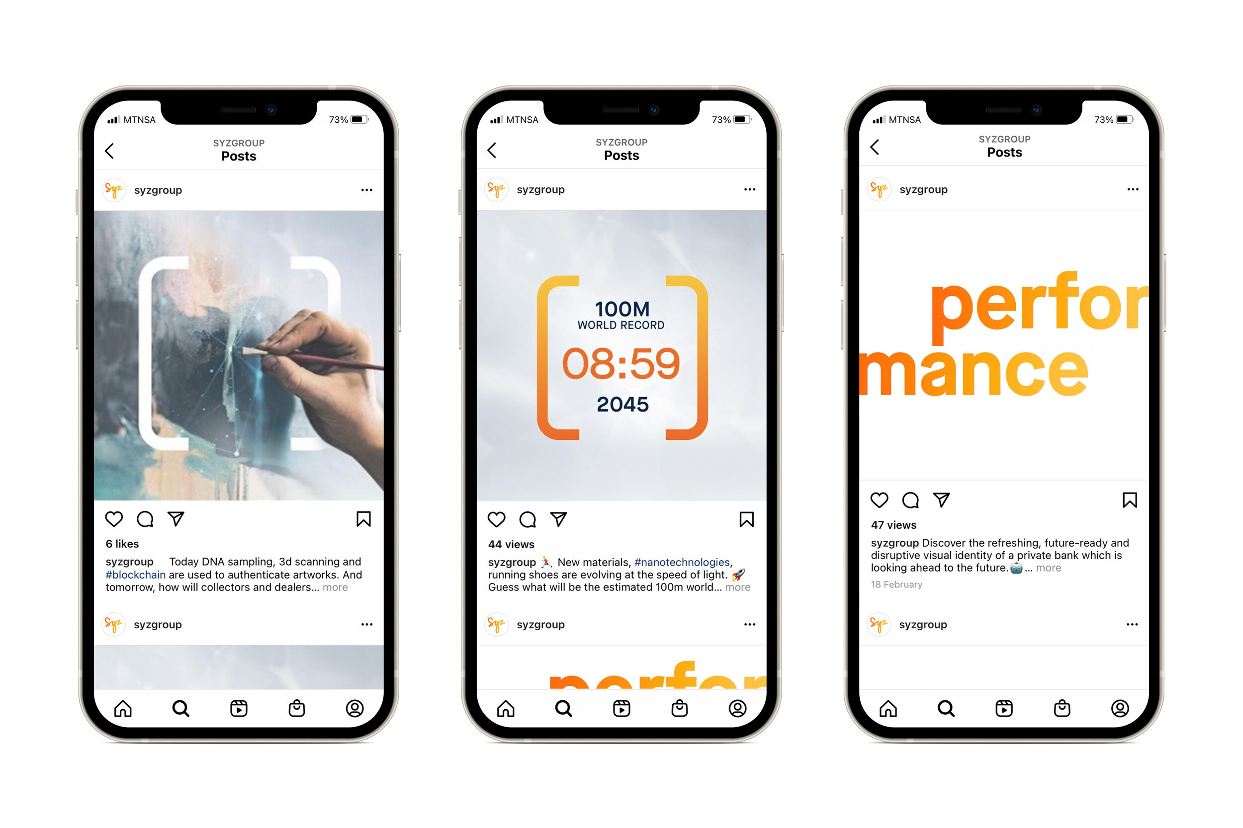
Solving the disconnect between a disruptive, dynamic business full of bright ideas, bright people in a modern office full of challenging, stimulating contemporary art, and a traditional visual identity, tone of voice and marketing mix.
Syz HQ, full of challenging, stimulating contemporary art. Images copyright Annick Wetter.
Syz's previous brand identity
We started work interviewing Syz people across the group to discover how they tell the Syz story. They told us about a business that had always looked forward, was client focused, with an entrepreneurial spirit at its heart. With their help we wrote a simple brand promise to guide everything they do.
Designed as a signature – the new logo symbolizes personal commitment. Rendered in a glowing orange to yellow vignette we named ‘Syz Sunburst’, the colours capture the excitement and positive energy of the Syz people and offices they call home.


